The Content tab will remain blank until content widgets have been added to the template layout. Once content widget/s have been added to the template layout the tab will become populated with various fields in a Details accordion and a Style accordion. The fields in the Details and Style accordions will vary depending on what content widget is currently selected on the template layout.
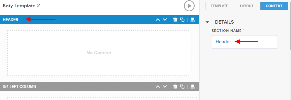
The Content tab for the selected section where you can rename the section name. Enter the desired Section Name in the field and it will automatically update the section name on the layout. Entering a new section name for each section you add to the template is required.
There is also a Delete button for you to delete the selected section, if desired.
Text Widget
If a Text widget is selected on the template layout, the following editable fields will appear in the “Style” accordion on the Content tab:
| Note: If you plan to use White text in your template, you should enter your text before changing the color; as the Editor window is not able to display white text on a white background. |
-
Border default value is None
-
Border color; default value is empty but preview block displays black
-
Border width; default value 1px
-
Padding (top, left, right, bottom); default value for each 5px
| Note: Using SHIFT+Enter in the Text Editor will create a single space, using Enter creates a double space. |
Adding Merge Fields
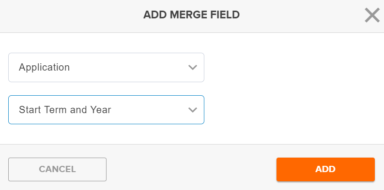
The Add Merge Field modal/popup appears when a Text Widget has been selected. This allows allows you to select an Object and Field to merge a user’s data into your text. After the values are selected, clicking the Add button will add the appropriate merge tag into the text component wherever the cursor is within the text.
Image Widget
If an Image widget is selected on the template layout, the following editable fields will appear in the “Details” accordion on the Content tab:
| Note: Email only supports the use of Image files. |
-
Alt Text is the text for your image that will be available to a screen reader.
-
Navigation URL allows you to indicate a URL that, when clicked, will direct the user to another site.
The following editable fields will appear in the “Style” accordion on the Content tab:
-
Background color will default to #fff (white).
-
Align (options Left, Right, Center) will default to Center.
-
Padding (top, left, right, bottom); default value for each 5px.
-
Border Style provides options for the button border; None, Solid, Dashed, Dotted. The default value is Solid.
-
Border Thickness allows you to control the border width. The default value is 1px.
-
Border Color Enter a color name (e.g., Black, Red) or a hexadecimal value for the color you’d like to use.
-
Border radius defines the edges of the button using 1, 2 or 3 values. The default is 5 px.
-
Padding defines the amount of space around the button (top, bottom, left, right); default value 5px.
Code Widget
The Code Widget allows you to enter your own custom code for the Email Template.
Image With Caption Widget
If an Image with Caption widget is selected on the template layout, the following editable fields will appear in the “Details” accordion on the Content tab:
-
Use External Image toggle to specify an image URL. When ON the Image Source URL field displays.
-
Alt Text is the text for your image that will be available to a screen reader.
-
Navigation URL allows you to indicate a URL that, when clicked, will direct the user to another site.
If an Image with Caption widget is selected on the template layout you will also be able to add an Image Caption; the “Style” accordion allows you to further customize the image.
Image Gallery Widget
The Image Gallery Widget allows you to define a series of four images to display in a section. Select a Gallery Style of either 2x2 or Vertical Stack. For each image, select whether to use an External Image or select the Folder and Image to use. The “Style” accordion allows you to further customize the images.
